
Keramiek is een product dat fabrieksmatig vervaardigd wordt. Het hoofdbestanddeel bestaat uit klei dat voorzien is van een print of een glazuurlaag die op hoge temperaturen in de oven gebakken wordt. Binnen de artikelgroep keramiek is een diversiteit aan soort en kwaliteit. Keramiek is de verzamelnaam voor aardewerk, terracotta, steengoed, gres en porselein. Keramiek kenmerkt zich door een grote verscheidenheid in kleuren en afwerkingen. Onze werkbladen worden vervaardigd uit grootformaat keramische platen. Deze grootformaat platen zijn niet alleen geschikt voor werkbladen, ook maken wij van deze platen wand en vloerbekleding voor uw interieur. Naast dit unieke maatwerk kunt u bij ons ook terecht voor eigentijdse, trendy keramische tegels voor wanden en vloeren van gerenommeerde tegelfabrikanten. Niet alle keramiek is geschikt voor een bepaalde toepassing en de verschillende keramische soorten vragen een ander onderhoud en toepassingsgebied. Graag adviseren wij u in de juiste keuze voor uw project.
Onderhoud van keramiek
In onze webshop vindt u alle onderhoudsmiddelen voor keramiek.
![]() Maatwerk in (natuur)steen
Maatwerk in (natuur)steen
![]() High-tech fabriek
High-tech fabriek
![]() Ruim 100 jaar ervaring
Ruim 100 jaar ervaring
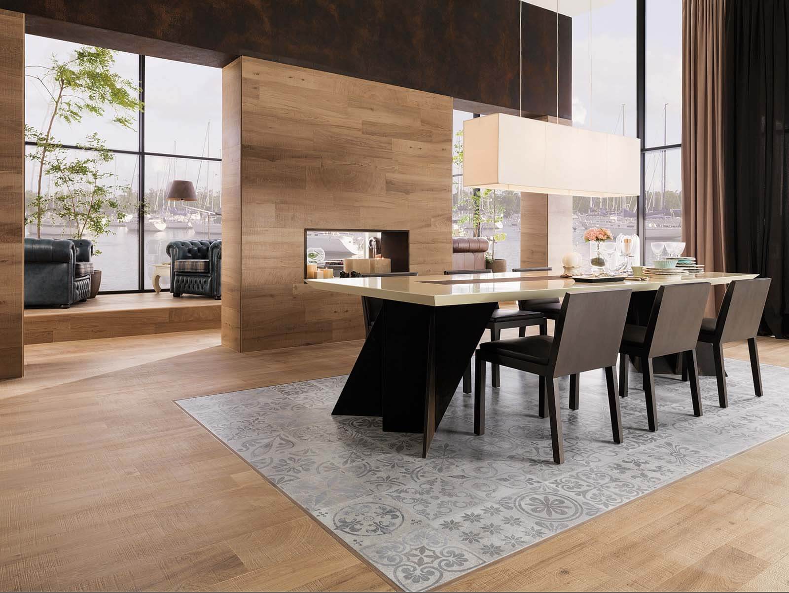
Keukenbladen van keramiek
Voor de vervaardiging van onze keramiek keukenbladen en elementen gebruiken wij hoogwaardig gesinterd keramiek van diverse fabrikanten. Keukenbladen van keramiek met een print zijn veelal wél door en door gekleurd, echter loopt de print en de structuur niet altijd door in de randen van het plaatmateriaal. Dit kan in een aantal gevallen zichtbaar zijn aan de randen, bijvoorbeeld bij tegellijsten en achterwanden. Ook kunnen er keramische aanrechtbladen af en toe kleine puntjes in de oppervlakte voor en zogenaamde hoog contrast-contaminaties (een donker puntje in een licht materiaal). Keramiek wordt per batch/charge geproduceerd hierdoor kan per batch/charge kleurnuance optreden.
Dagelijks gebruik van keramiek
Keramiek is in het dagelijks gebruik een zeer gemakkelijk materiaal. Het is waterdicht, het kan tegen warmte , is bestand tegen veel agressieve stoffen en sommige oppervlakten zijn krasongevoelig. Toch is er een aantal zaken waar u rekening mee dient te houden bij keukenbladen van keramiek. Keramiek is een zeer compacte, harde massa en daardoor relatief gevoelig voor stootschade. Wees daarom voorzichtig met zware voorwerpen. Bij het stoten tegen of het vallen van voorwerpen op/tegen het keramische werkblad kan dit nagenoeg onherstelbare schade veroorzaken. Vermijdt reinigingsmiddelen met een PH-waarde van < 2 of > 12. Hoewel minder krasgevoelig dan natuursteen of composiet kunnen op het keramisch blad, afhankelijk van de oppervlakte, krassen ontstaan. Gebruik daarom altijd een snijplank. Hiermee voorkomt u eventuele krassen op het keramiek werkblad als wel het bot worden van messen. Ga nooit op het keukenblad staan of zitten. Laat ook apparatuur dat stoom produceert (vaatwasser, stoomoven) geruime tijd uitdampen voordat je deze weer sluit of zorg voor een goede ventilatie. De dampdichtheid van keramiek kan in gesloten ruimte zorgen voor aantasting van houten delen of delen die gevoelig zijn voor vocht.